Green Pasture
Packaging redesign clarifies product lines
My Role
- Branding & Brand Extension
- Package Design
- Typography
- Print Coordination
- Branding & Brand Extension
- Package Design
- Print Coordination
- Typography

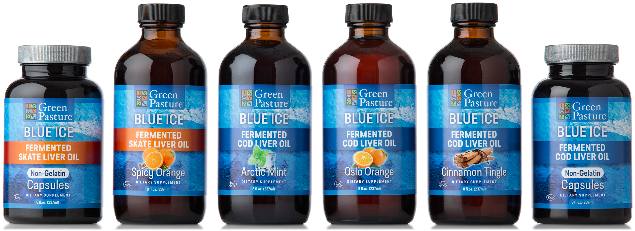
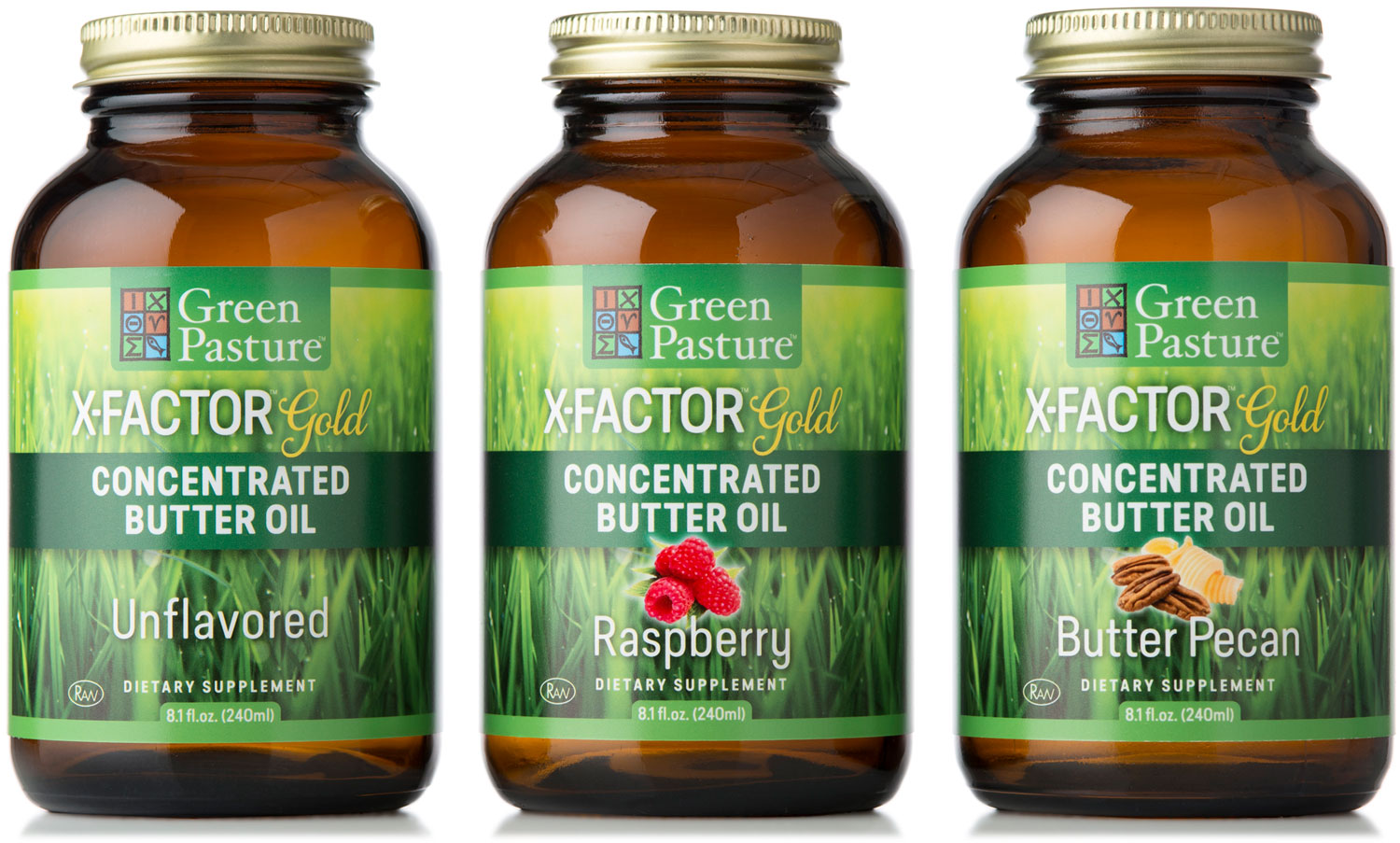
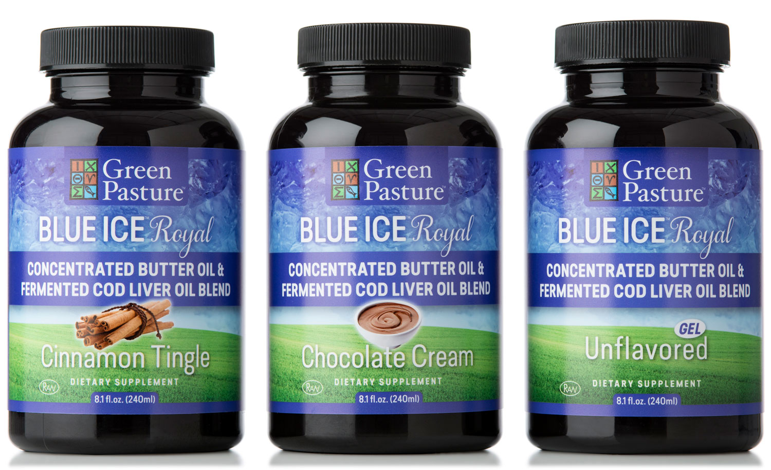
With a design refresh for their fish oil and supplement products long overdue Green Pasture asked me to redesign six of their multiple lines of products. Taking my cues from their existing labels—their desire was an evolution and not a completely new design—I kept some of the original design elements while strengthening the product flavors to focus consumers away from association with “fish oil” taste. With many long product names, and product descriptions, I choose a friendly, but modern, condensed font that is also highly readable, especially at small font sizes. The labels are designed to look best on the web where the majority or their product is sold.