Skagit Valley College
Revolutionizing an educational institution’s digital presence
My Role
- Research & Analysis
- UI/UX
- User Testing
- Web Accessibility
- Content Strategy
- Information Architecture
- Content Editing
- Data Analysis
- Team Management
- Web Design
- Institutional Branding
- Photography
- Research & Analysis
- Content Strategy
- Team Management
- UI/UX
- Information Architecture
- Web Design
- User Testing
- Content Editin
- Institutional Branding
- Web Accessibility
- Data Analysis
- Photography
- Typography
In 2016 I was hired as the Digital Content Specialist at Skagit Valley College (SVC) with the specific intent of completely redesigning the main SVC site, which was built upon a sixteen year-old CMS. The process started with an in-depth study of community college and four year college websites in Washington State and across the country to understand the intrinsic strengths and weaknesses of college websites as well as user flows and needs of the various personas coming to the SVC site.
Sixteen months later the college website was launched, and was a resounding success sporting a fresh new look over a highly organized, easy-to-navigate site where each page has been optimized for clarity and ease-of-use.
Conversation excerpt from SVC President, Dr. Tom Keegan to a senior administrator at SVC, during the annual Spring Celebration 2018:
“I was talking with the President of Bellevue College, and he said they are in the process of redesigning a new website. In their research, he said, they reviewed all the community college websites in Washington state he feels we have the best one he’s seen, and they want to model their new site after what we’ve done.”
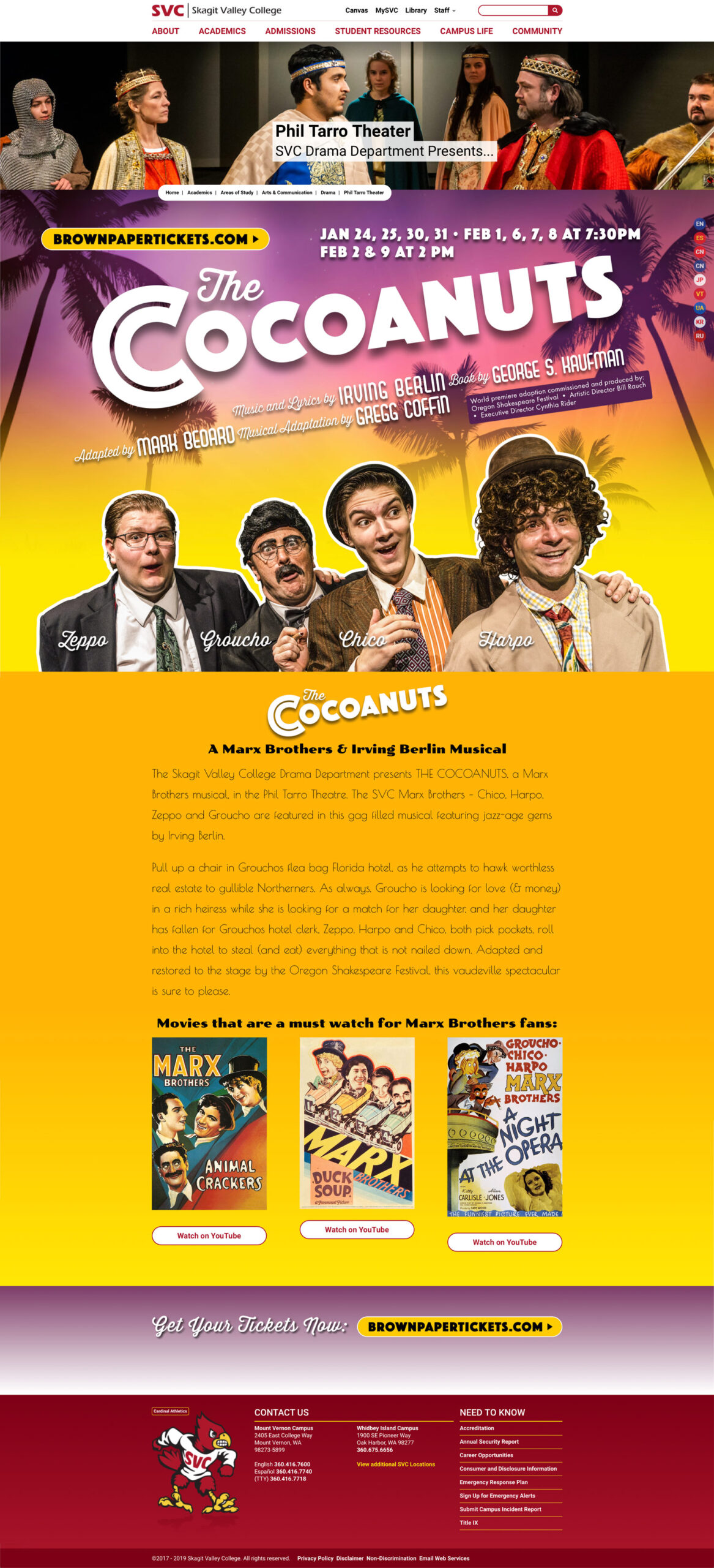
Skagit.edu resulted from extensive research of two and four-year college websites, combined with my experience in e-commerce and visual design. Implementation of best practices in UI/UX, semantics, navigation, typography, visual hierarchy and original photography created a visually compelling, easy to use website.
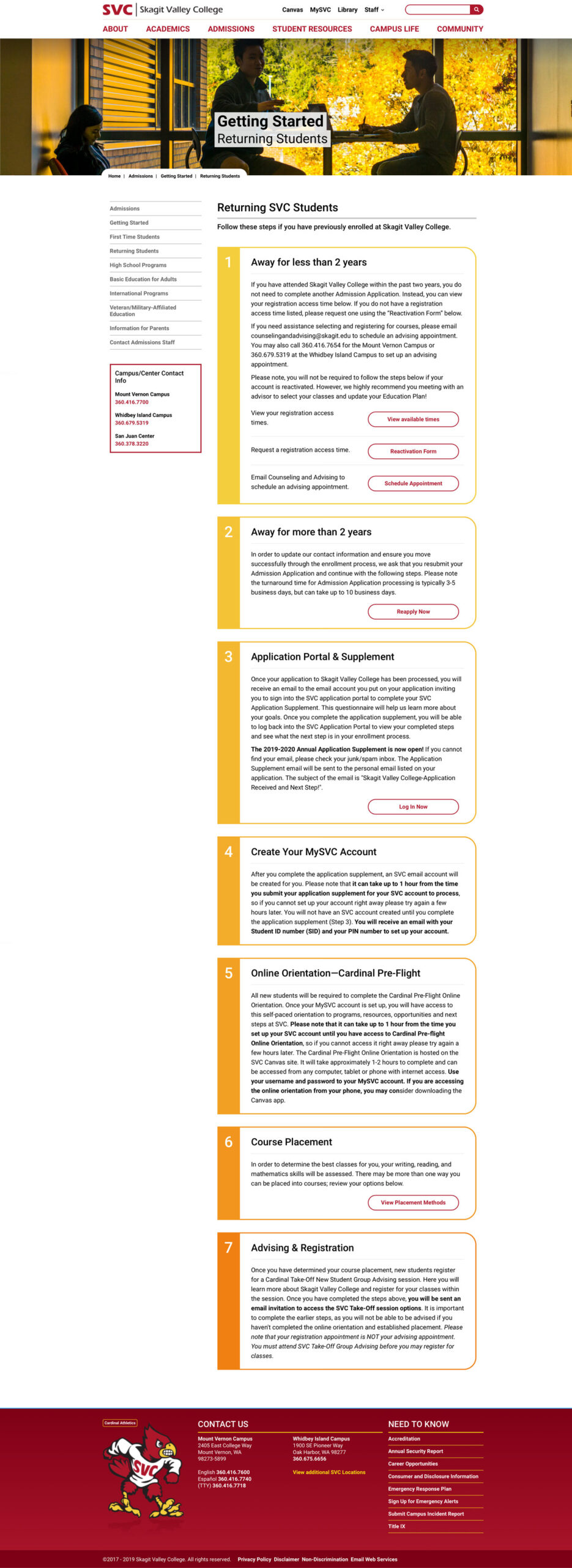
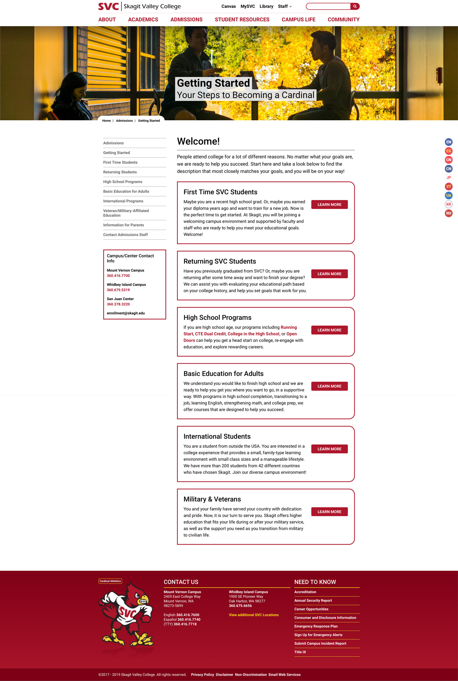
Customizeable templates were created to suite different departments, functions and events, making site navigation easier with better organization and structuring information in to scannable chunks. Complex informational pages like Getting Started for Returning Students was grouped into sections with obvious actions steps that made enrollment by prospective and returning students more efficient.
Supporting Websites
Skagit Valley College has 19 sub-sites with specific content and functionality for different students, faculty and community needs. These sites were redesigned in order of priority—a mix of traffic, audience, need and ease of construction—with the library site being the second most trafficked SVC site. Critical to the development of these sites is extending the brand to each site has a unique character while being part of the SVC look-and-feel.
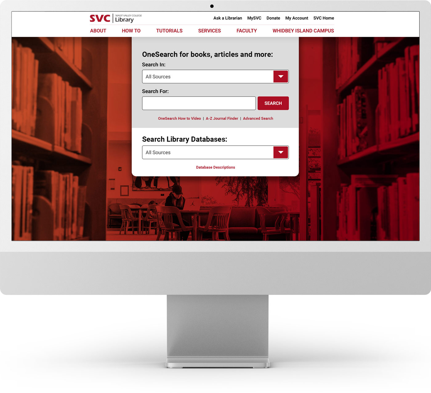
Skagit.edu/library
SVC’s second most popular site—one critical for student success—was designed with an emphasis on user research showing the user’s primary intent was to search for resources. The result is a focused home page with a search module front and center, directing users immediately to finding what they need.
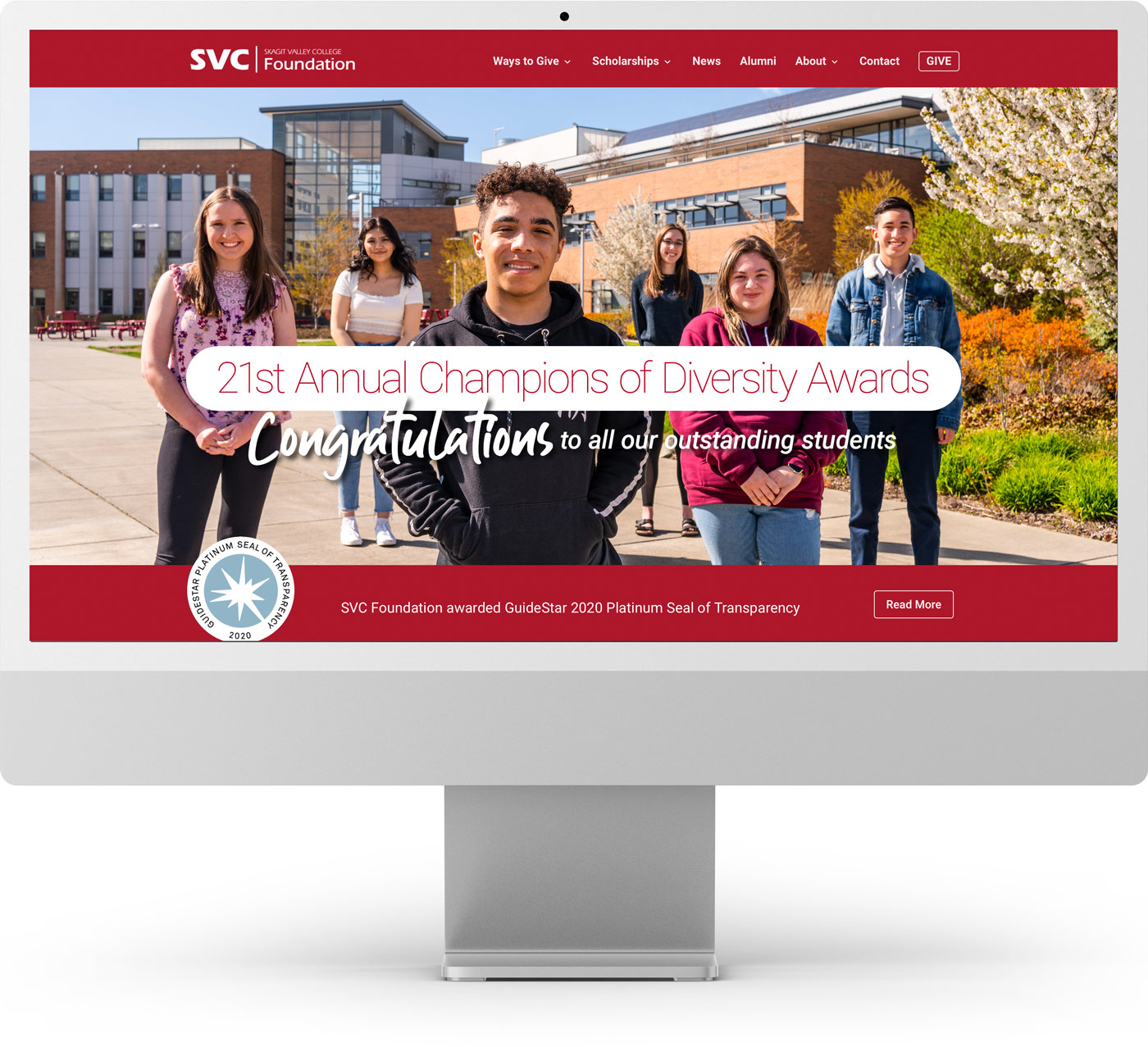
SkagitFoundation.org
Website for the fundraising wing of the college, the site connects the great community and donors to raise funds for everything from scholarships to emergency funds for students in need of supplies, childcare and more so students can achieve their goals.
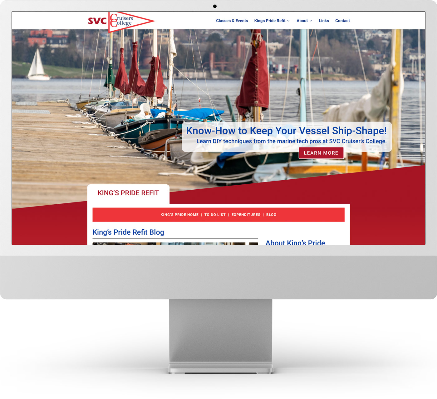
CruisersCollege.org
This site was redesigned in WordPress to highlight seasonal workshop offerings, feature the program’s student projects and expose viewers to their growing how-to blog on YouTube. My implementation of email signups was a true success in growing their email list from 44 to nearly 700—and growing—over a few years with no advertising. Subscribers receive monthly emails with program news, classes and events.
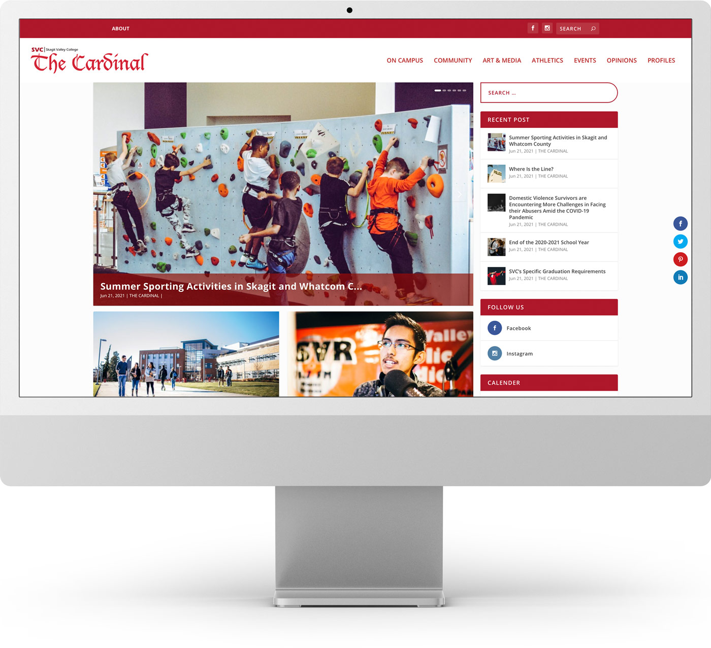
The Cardinal Online
I initiated this website after talking with students who showed greater interest in this online news source than the traditional quarterly printed newspaper, and gaining consensus from the journalism faculty. This WordPress site was designed to empower students in the journalism department, across all campuses, to publish their work on demand, as well as providing students valuable hands-on experience with modern publishing tools.
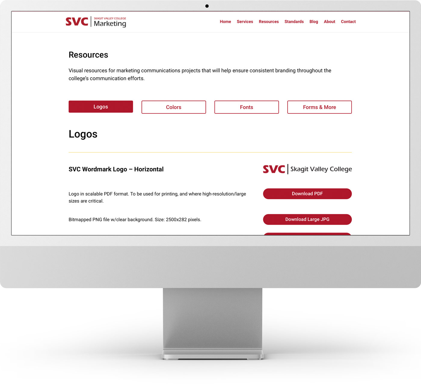
Marketing.Skagit.edu
With increasing requests for the college’s branding guidelines and assets I created the first online repository for staff and faculty to easily access the files on their own, saving the marketing staff critical time.
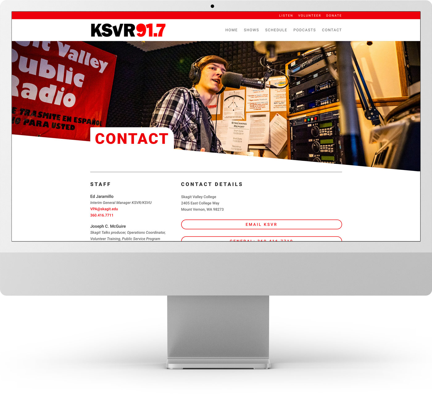
KSVR.org
This website is the digital face of the non-profit community radio station which serves the Skagit County with music, news, and talk shows spotlighting the college and community at large.
Design & Implementation
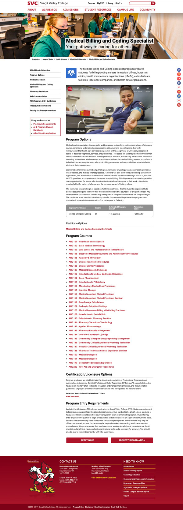
Departmental Program Page V2.0
By using best practices from my years of experience in e-commerce I designed the pages in Skagit.edu to use modular chunks of content—each tailored to optimize the user’s experience and make it easier for prospective and current students, and staff to find what they need.
Students express unanimously that the site was easier to navigate, and pages were easier to read, and locate the information they needed. I often received positive comments that the SVC site looked better that other college site they had visited. And in one case, the site was the reason they choose SVC over other colleges.
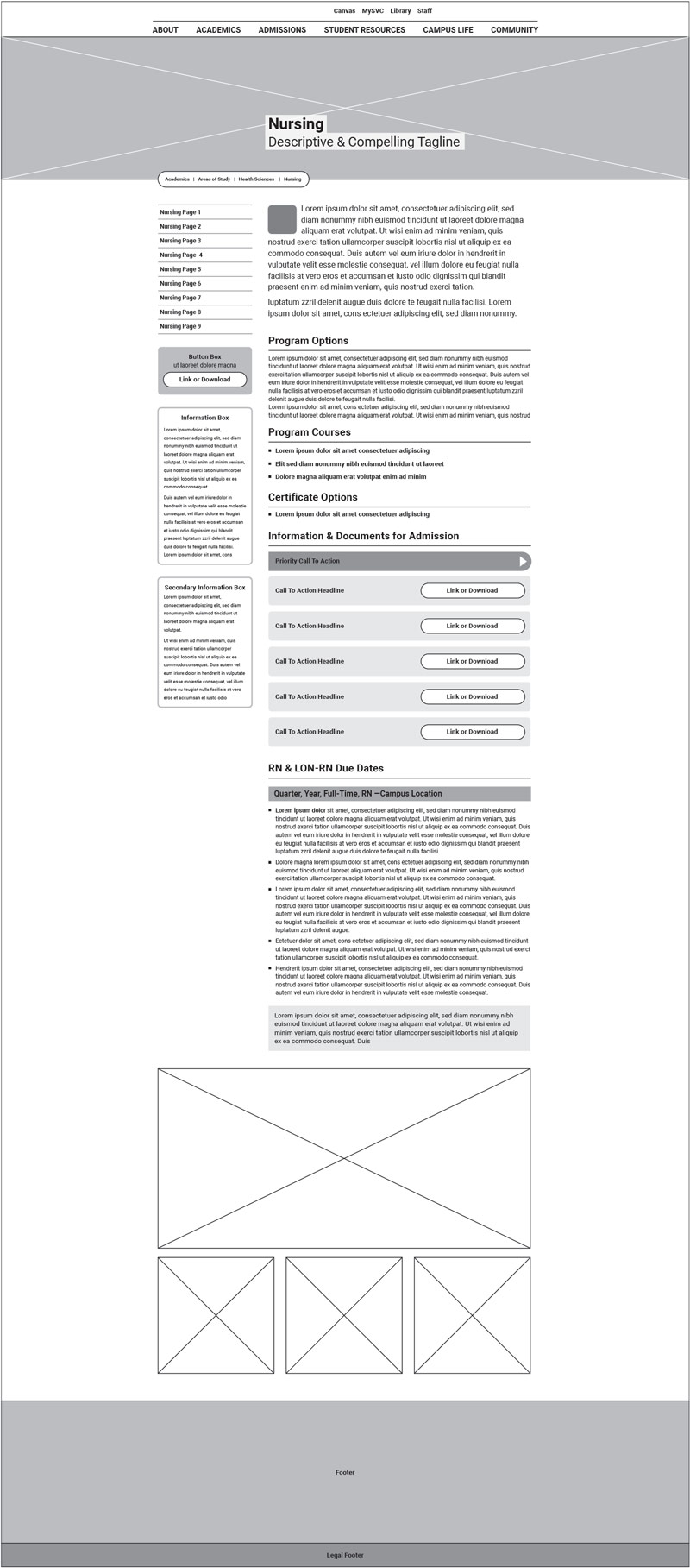
Wireframe
I utilized wireframing in the initial design and content phase of the website redesign—a first for the Skagit Valley College. This proved invaluable for stakeholders to focus on specifically oncontent and layout.
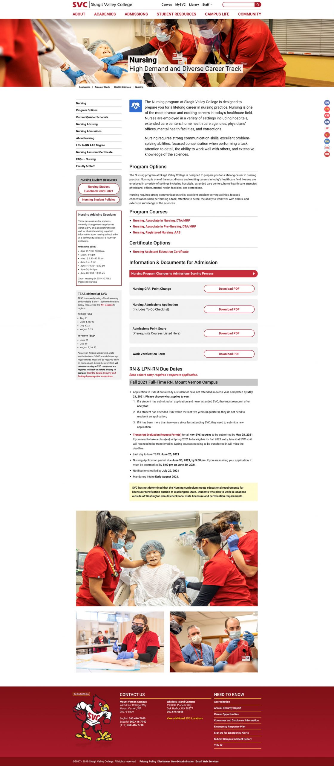
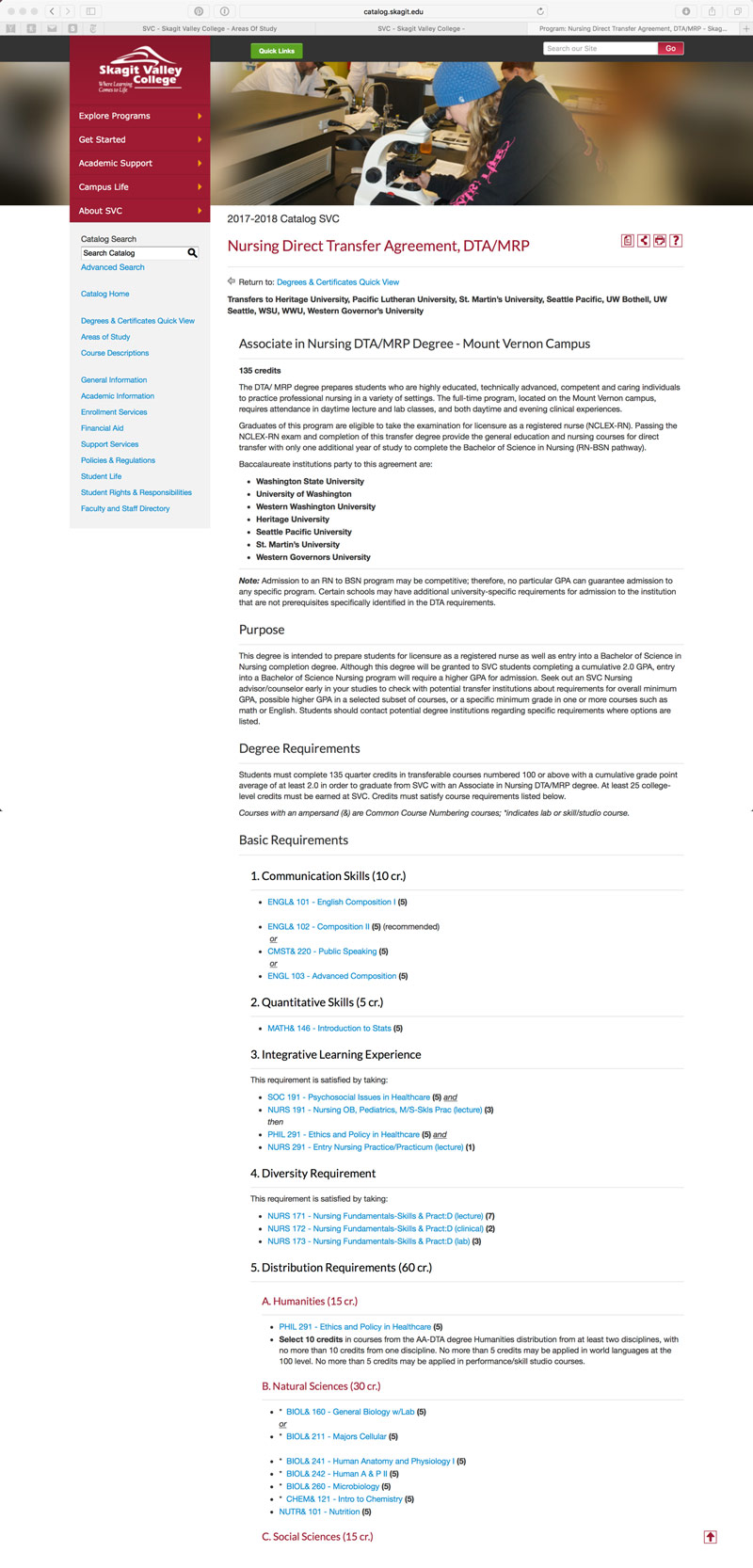
Before Redesign
The legacy design was built on a sixteen year old CMS and consisted of thousands of monotone pages built with little understanding of UI/UX.
Optimizing Site Structure
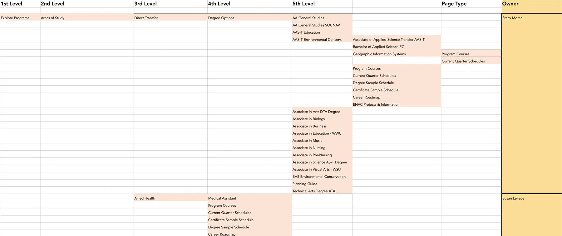
While evaluating the SVC’s legacy site I created a spreadsheet of all the existing pages, how deep the pages were and asigned “page owners” to specific pages or page groups. This process minimized the overall depth of the site, reducing the number of clicks needed to access content. It also provided a visual way to organize and restructure the site. Page owners were tasked with reviewing content which distributed the workload of culling and refining the number of overall pages—going from over three thousand to just over three hundred pages.
Site Navigation
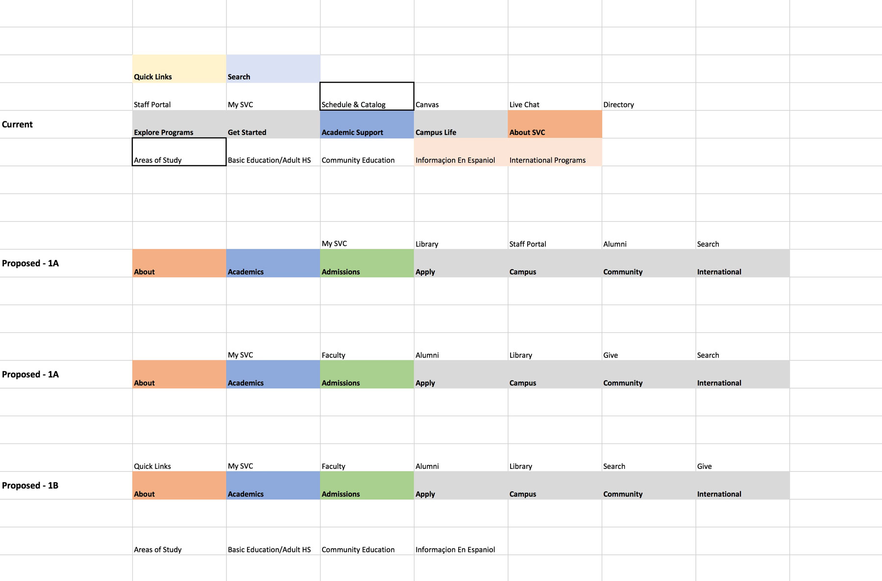
The final main navigation layout was the result of analyzing the navigation menus from community colleges, colleges, and universities in Washington State and nationwide. After mapping out the best examples in a spreadsheet with color coding I then arrived at several options presented to stakeholders and focus groups. The image below shows three potential options with the legacy version at top.
Iterative Design: Business Needs & User Feedback
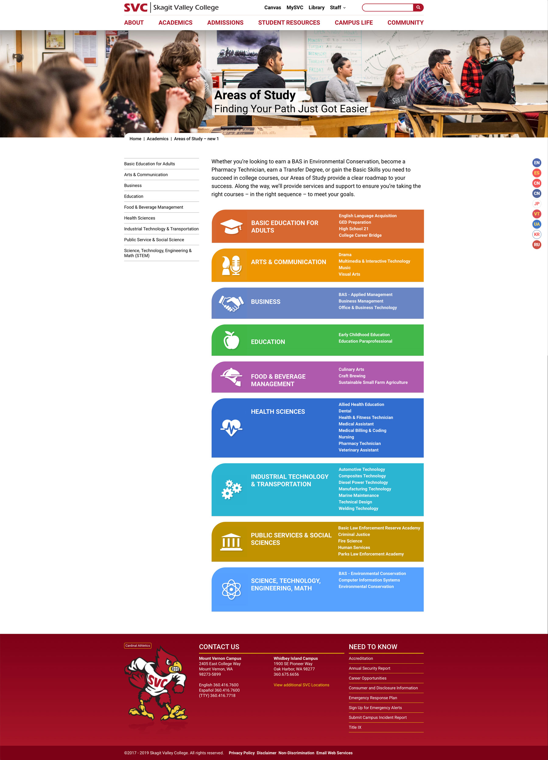
The Areas of Study page is a critical nexus point for users to get to the specific information they need, which in turn, leads to enrollment. Over time this page was redesigned to make it easier for students to click thru to the next level. The second revision relied on student focus groups to arrive at a more efficient solution.
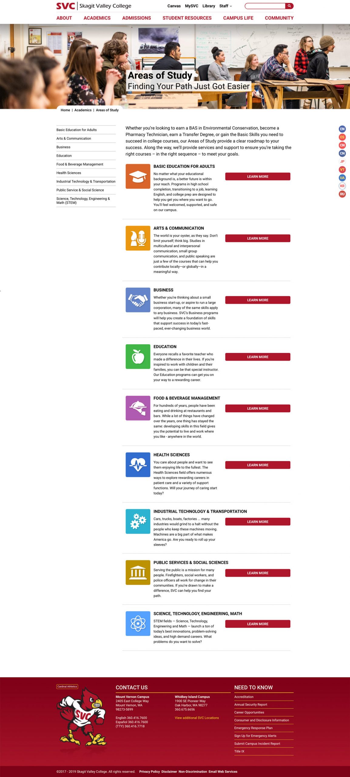
Original Design
This design was organized around the icons and color coding of the Areas of Study making it easy for users to quickly scan by image and/or the Area of Study title.
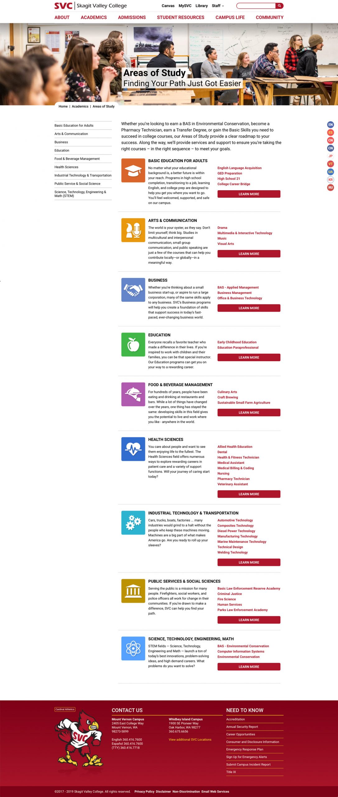
First Revision
The first revision resulted from the need to surface granularity before clicking to the next level. User feedback revealed nearly all users bypassed the descriptive text going right for their specific Area of Study in the right-hand column.
Second Revision
Streamlined design using solid color grouping, the focus group favorite, is easier for the eye to search for, and find, the student’s desired Area of Study. The eye is quickly able to scan vertically and then horizontally, ending with a short list of subareas.


